Welcome into our "new" home! We've been in our home for 9 years and a few years after living here we knew we wanted to do a big remodel. A lot of the spaces weren't used efficiently and everything was very dated! The project was a complete overhaul and we didn't have any natural design skill so we enlisted the help of Hayley from HLC Studio. She knocked it out of the park and we are so thrilled with the finished project.
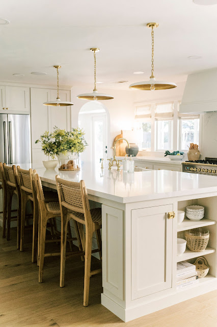
One of the most frequent questions is about the paint colors Hayley used to create a fresh, classic, warm and rich feel. Our home was built in the 70's and so we have low ceilings by today's standards. We also face North and so we don't get a lot of natural light into the rooms. For those two reasons, Hayley used Chantilly Lace from Benjamin Moore on most of the walls, baseboards, trim and ceilings.
A funny story was Kevin HATED the "white" when it first went on the walls. He was beyond skeptical but Hayley was a pro at explaining her rationale. At the time we still had concrete subfloors and of course not one item of furniture or decor. It was literally white walls and that was it. So it looked pretty stark at the time but Hayley explained it was necessary for the ceiling height and lack of light. As she knew, all the other elements in the house warmed it up. I am SUPER happy we stuck with it.
The kitchen cabinetry color is probably my favorite of all the paint colors. I remember Hayley showing it to me next to the white walls and I wasn't sure but I trusted her expertise. It's such a unique color because it's neutral but oh so rich and warm. It's gorgeous to say the least! The color is Natural Cream again by Benjamin Moore.
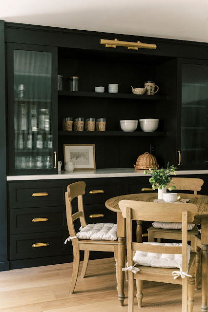
As a contrast there is black cabinetry throughout the main living areas. It makes a statement and is stunning. However, it is tough with kids just to warn anyone thinking about using black. This is called Tricorn Black by Benjamin Moore.
The color on the mudroom cabinets is a very close second to the kitchen cabinetry. This is Classic Grey by Benjamin Moore. I have to say I see no grey in this color, lol. It's another subtle but rich color that pairs beautifully with the unlacquered brass hardware.
The same color is used throughout Emily's room on the vertical panelling and baseboards.
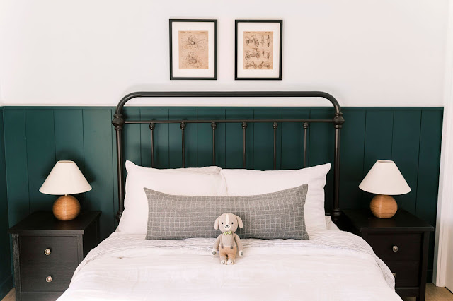
The last paint color we used in the house is Hunter Green also by Benjamin Moore. Yet again, this was a color that Kevin didn't like when it went up on the paneling. A word of wisdom; don't judge a paint color in a blank room. All the decor and furniture completely change the whole feel! This color is so rich and I love it for Jack's room. Jack is as big as fan as I am; he talks about his "green room" and wants a green dog to match his room. He absolutely cracks me up.
Designer: Hayley Chavez HLC Studio
Photographer: Ellie Koleen
To see the DRAMATIC Before & After Photos check out this post:
To shop our home:


Home decoration is a great way to express your style and personality. If you are looking for unique ideas, consider hire our adventure fiction writers to add a touch of creativity and imagination to your home decor projects.
ReplyDeleteThe paint colors you chose for your remodel look fantastic! The blend of tones brings so much character and warmth to each room. Your selections have inspired me to think about adding unique touches to my own space, and I’m considering custom pillows or wall art. Using a digitize embroidery service could be a fun way to personalize home decor with custom patterns or monograms that complement the new color scheme. It’s such a great way to carry a consistent design theme throughout a home, adding subtle yet meaningful detail. Thanks for sharing your creative ideas and color choices!
ReplyDeleteHave you lost money to Cryptocurrency Investment, Forex Trading or Binary Options 📉📈⁉️❓
ReplyDeleteYou should take a munite to read this.
Since the announcement 📢 returning Elected President Donald Trump made about making bitcoin a payment method, the price of bitcoin has sky rocketed, and everyone wants to buy and own sum amount of Bitcoin.
Though the best option isn't just to buy but also to trade with your bitcoin. With the lack of experience and scam adverts out there, so many individuals have fallen victims to Scam and fake crypto trading platform, if you are one of this victims, you should conatct PYTHONAX✔ immediately.
ℹ PYTHONAX provides you a chance of recovering your money back from this scam platforms using our expertise on hacking and tracing translation using transaction id, and some other few details if needed. We do not require any personal info about you, every details we ask of will be concerning the scam. You can choose to remain anonymous when you contact us.
⚠️ We do not have a 💯% guarantee that your money would still be available, it might have been spent, so we do a proper check to know if it is or whats left of it, after this we developed the best strategy needed to help you recover your money and give you a detailed breakdown about it. We aren't doing anything illegal, don't panic, we are simple elping you get your money back, using our skills and talents.
▪️We also provide hacking services like-:
▪️Phone & Computer hacking.
▪️Website and Domain Hacking.
▪️Emails and Social Media hacking.
▪️Location Tracking.
▪️Deleted files and Messages Recovery.
▪️Bitcoin mining...... etc......
Contact emails-:
Pythonaxhelp@protonmail.com
Pythonaxservices@protonmail.com
2024, Pythonax Services ™️.
Our reputation precedes us.
All Right Reserved ®️.
One of the most frequent questions is about the paint colors Hayley used to create a fresh, classic, warm and rich feel. Our home was built in the 70's and so we have low ceilings by today's standards. We also face North and so we don't get a lot of natural light into the rooms. For those two reasons, Hayley used Chantilly Lace from Benjamin Moore on most of the walls, baseboards, trim and ceilings.
ReplyDeletecricut machine sale
cricut mini press
cricut card mat
mini heat press
cricut explore
cricut maker 3 black friday
My sincere gratitude to BTC Web Recovery for his professionalism, truly, he is a real deal. I would not waste my time with any other hacker and wished I had known them sooner. I am writing this review to be of help to everyone out there, who in one or two ways has been scammed by online investment platforms. After going through a lot to recover my bitcoin although many people told me it’s impossible. If you’ve lost your bitcoin as a result of investing in binary options, trading platforms, your account was hacked or other bitcoin related scams or lost money to scammers online in whichever ways then You’re not alone. (I lost over $97,950 to skyrockettrade). Being a scam victim myself, I tried several means to recover my funds all to no avail, until one day I came upon an article in the Local News about Btc Hackers Recovery, they literally saved my life, all i lost to these fake investors skyrockettrade was recouped in just a few days (a total of 3.7721 BTC) was recovered, Kindly send a message to the contact below if you’ve been in such situations and you are seeking recovery. contact them via:
ReplyDelete( btchacke@cyberservices.com )
Telegram: @Btchackercyberservices
What I love most about TechyGossip is its ability to make advanced scientific topics feel accessible. Each article blends clarity with excitement, guiding readers through cosmic mysteries, groundbreaking experiments, and the evolving landscape of technological innovation with impressive depth.
ReplyDeleteFinanceProper feels like a reliable companion for anyone navigating financial challenges and staying updated on world affairs. The content is clear, engaging, and deeply informative, guiding readers toward better decisions and a stronger understanding of global economics.
ReplyDeleteI admire how TechBusinessTips consistently delivers knowledgeable, well-structured content that supports smarter business development. The articles highlight essential trends and tools that help readers stay competitive in tech-driven markets. It’s an invaluable platform for continuous learning and improvement.
ReplyDeleteLove these quick and realistic breakfast ideas—perfect for busy mornings when time is limited but nutrition still matters. The snack plates and overnight oats are especially practical, and I like how flexible the suggestions are for different kids’ preferences. I often enjoy reading similar family-friendly lifestyle and daily routine content on platforms like Hurawatch entertainment hub, where topics around everyday balance and home life are also explored. Great inspiration for moms trying to keep mornings stress-free!
ReplyDelete